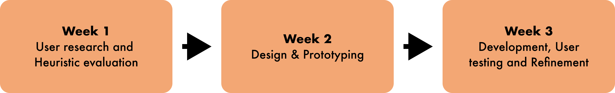
SisterWorks

SisterWorks Photo

Overview

When we were asked to redesign an NGO website for our project, I suggested SisterWorks. As a team composed entirely of women from different backgrounds, we resonated deeply with SisterWorks' goal to empower refugee and immigrant women. Also, we recognised the need for significant improvements on their existing website. Motivated by these factors, our team took the challenge to redesign and enhance SisterWorks' website.

In our redesign process, you will discover our deliberate focus on targeting immigrant and refugee women as our primary users. We will walk you through our thoughtful approach on why we focused on enhancing the homepage, training course page, and registration form as the focal points for improvement. Furthermore, we will explore the iterative steps we took to finalise the design, incorporating feedback and refining it to create a responsive experience that caters to both desktop and mobile platforms.

Roles & Responsibilities

Group of 3

My responsibilities were:

Tools

Timeline

Background

SisterWorks is a not-for-profit social enterprise, based in Melbourne. They help women who are refugees, asylum seekers or migrants to become economically empowered by providing training and career support. Learn more about SisterWorks.

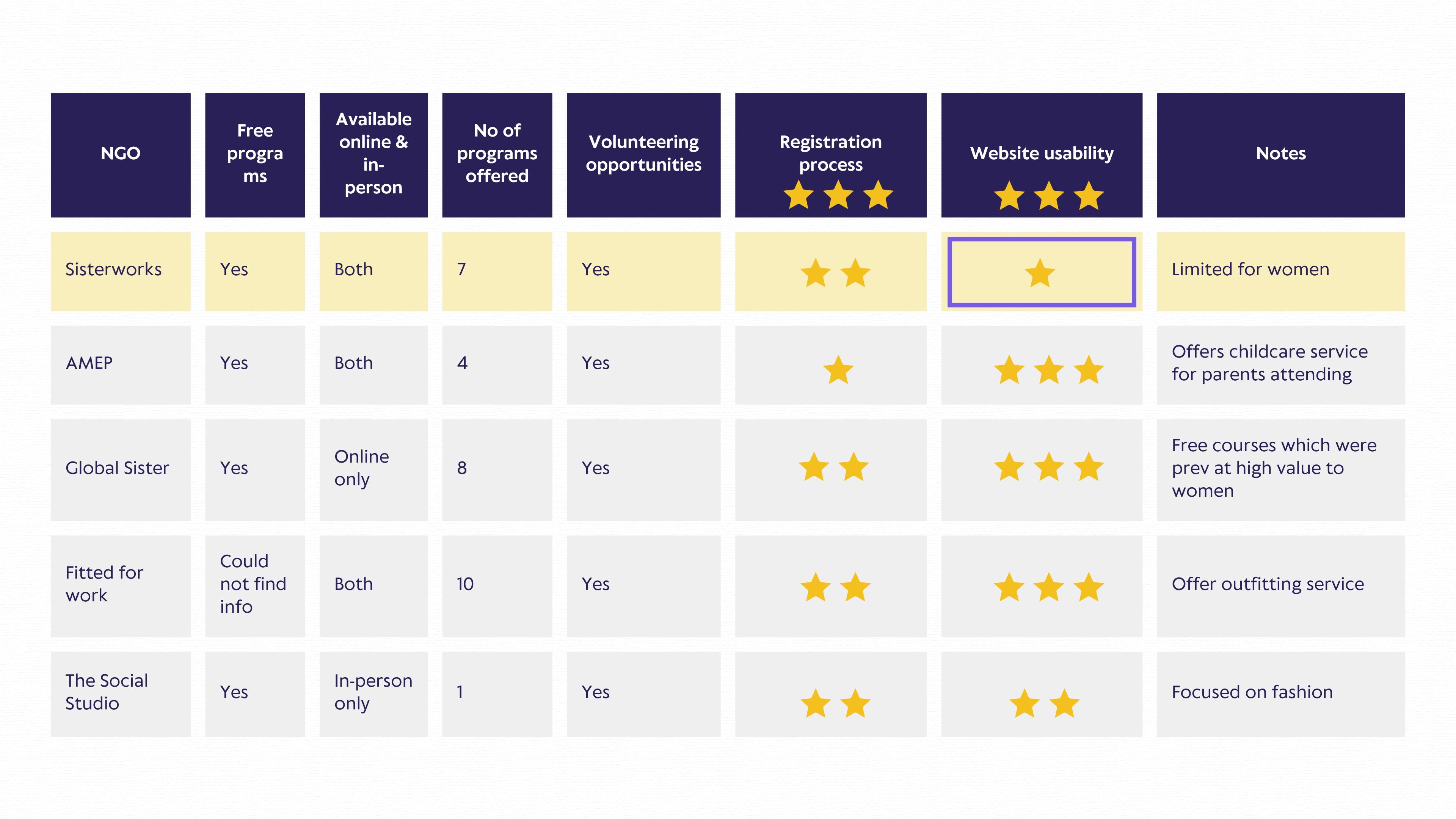
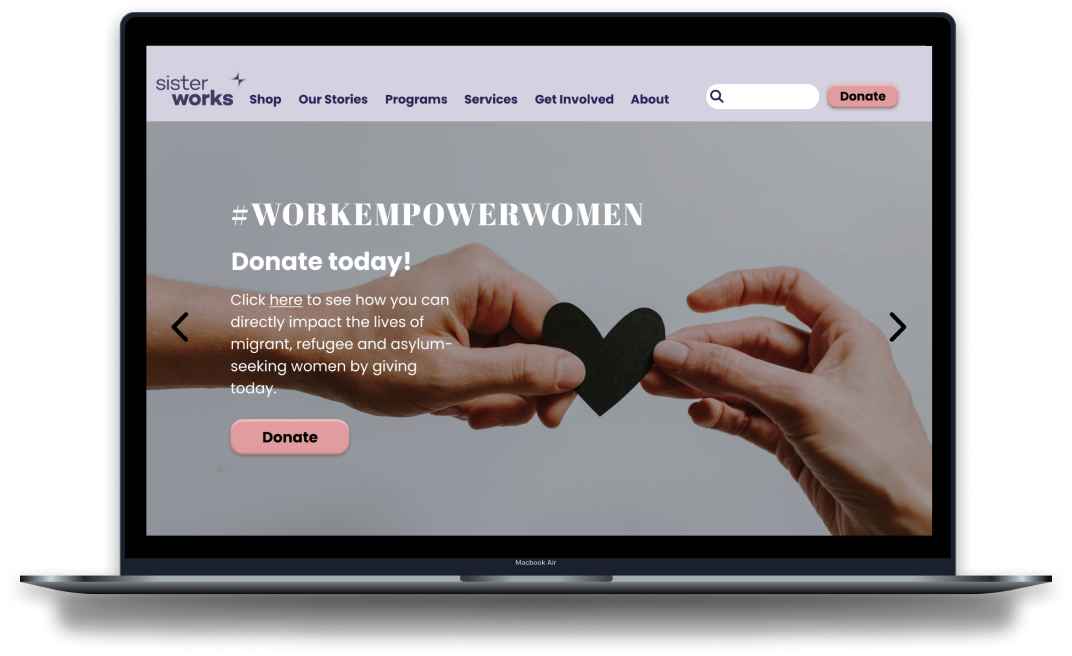
We started by analysing Sisterworks' existing website and we discovered that while their homepage primarily targeted donors and volunteers, the primary goal of Sisterworks was to provide support to women in need. To address this misalignment, we refined our personas to focus on the immigrant and refugee women whom SisterWorks sought to assist.

Understanding the Problem

Secondly, we conducted interviews with users of the SisterWorks website. We engaged in interviews with five individuals, presenting them with a set of 10-15 carefully curated questions.


We identified five key themes that emerged from our interviews:

  • Reasons for Immigrating: Participants expressed a strong desire to pursue a better life and seek improved opportunities by immigrating to Australia.
  • Pain Points: The language barrier and limited local experience or qualifications were cited as significant challenges in their journey in Australia.
  • Types of Support & Programs: Our interviewees emphasised the importance of accessible training courses.
  • Face-to-Face vs. Online Courses: Respondents expressed a preference for having options when it comes to accessing support
  • Volunteering: Many participants expressed a keen interest in giving back.
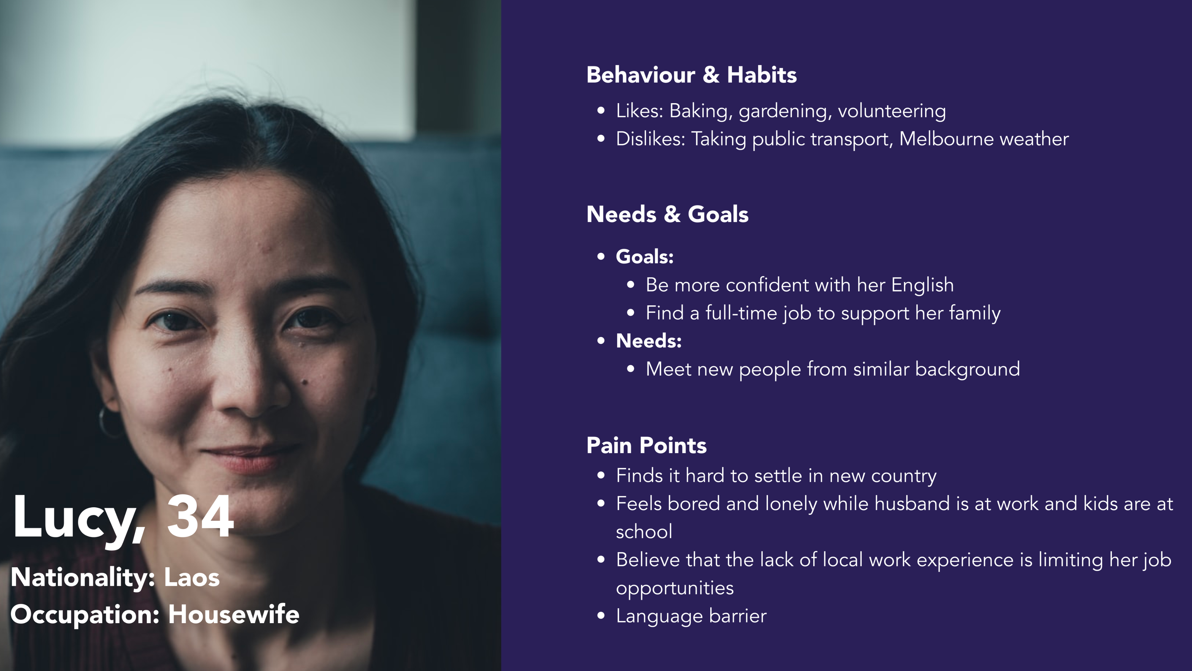
User Persona

We were then able to finalise our user persona, meet Lucy!

Problem statement:

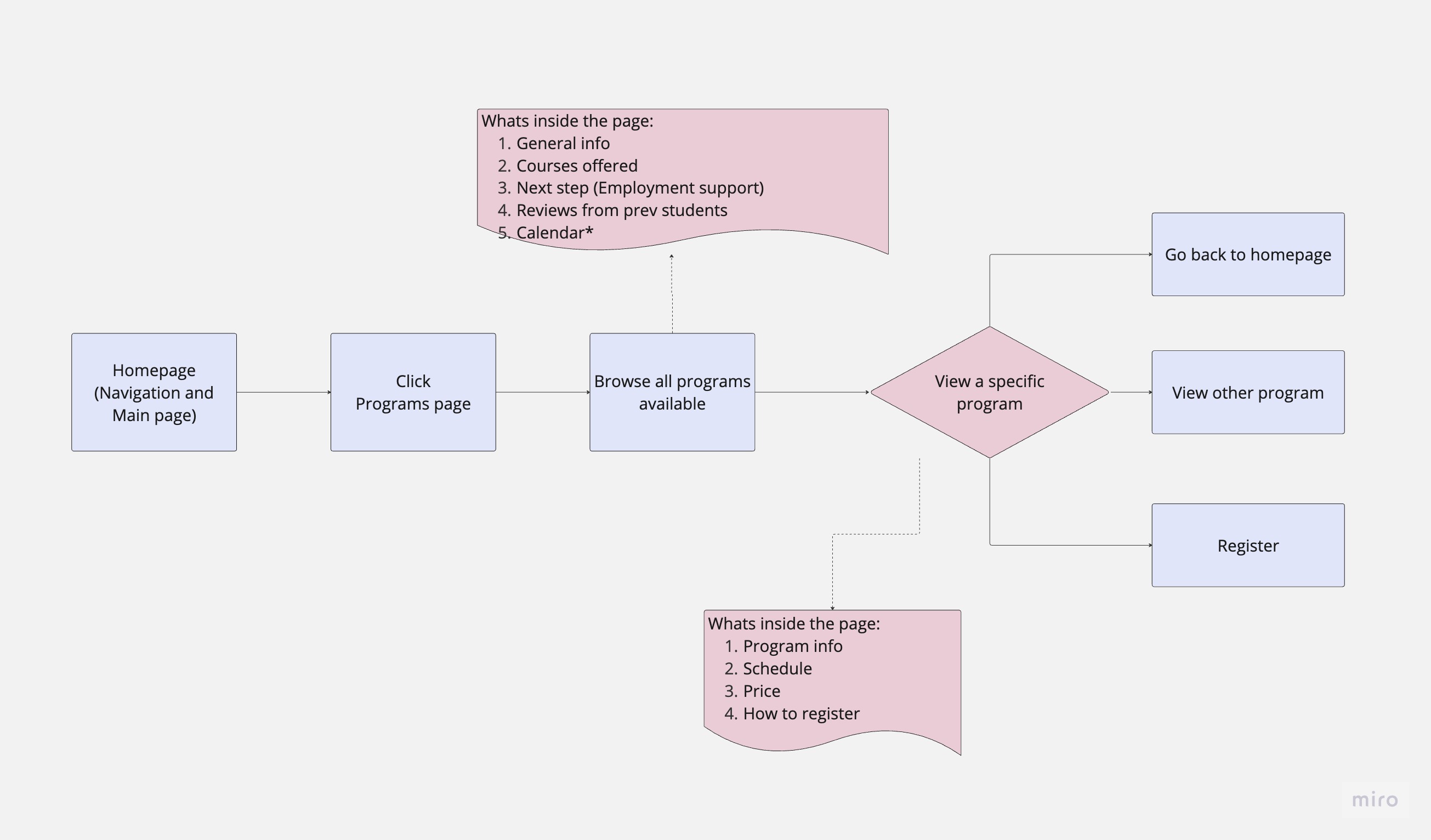
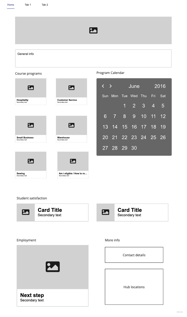
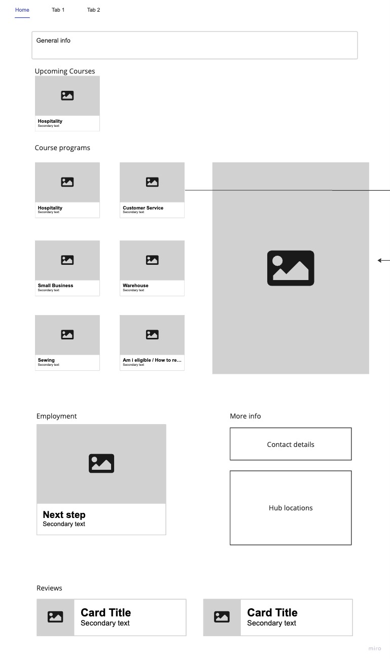
How might we leverage the SisterWorks website to help empower women who are refugees, asylum seekers, or immigrants to acquire skills and find employment opportunities?

Competitor Analysis

To better understand how SisterWorks measures up against its competitors, we conducted a competitor analysis, comparing their website with other four NGOs. Highlighting their website usability for a low score.

Website Usability

We conducted a heuristic evaluation:

Positive

  • Easy-to-find contact information
  • Consistent navigation with clear options to return to the homepage
  • Meaningful use of images to enhance the user experience

Negative

  • Homepage lacks clear presentation of available help and training programs
  • Inconsistent design with frequent use of external links
  • Absence of breadcrumbs and headings, making it difficult to determine user location
  • Unclear information hierarchy and lack of emphasis on important content
  • Limited and unclear course information
  • Difficulty in locating search, login, and help buttons
  • Lengthy forms pose a usability challenge

We also invited a few of our classmates to test the current Sisterworks website. From here, using the prioritisation matrix we were able to identify the key features that we will focus on in our redesign process.

  1. Improve homepage and display program courses.
  2. Clear program information without external links.
  3. Simplify registration form.

User Flow

Based on the identified features, we divided the task to each team member. I took on the challenge of redesigning the Program Page. From here, I will primarily focus on sharing the details of my work and the improvements made to the program page.

Wireframing

I began creating my wireframe using Miro and recognised the need to create multiple layouts for testing. To determine the optimal design, I conducted an A/B testing.

User Testing

The A/B testing led me to incorporate elements from both the A and B layouts. I also need to create two pages, one showcasing all the available program courses and another providing detailed information about each program. I quickly implemented these design changes into a clickable prototype and conducted another round of user testing.


Solution

Program page - a page consist of all offered courses

  • Created a concise program description instead of using bullet points
  • Streamlined the "Next Steps" section, merging it with the "Why attend this program" section
  • Revamped the presentation of the course schedule using a user-friendly table with filtering options
  • Removed redundant contact information, opting to include it only on the detailed program page

Detailed program page - the specific page of a specific course

  • Summarized common program details such as delivery mode, duration, and cost
  • Grouped program details by location for easy reference
  • Included course overview and "why attend this program" information directly on the page
  • Added information about teachers and ratings from previous program participants

Final Prototype

Here’s a video of the final prototype. You can also check the figma file desktop and mobile


Final Thoughts

  • I really enjoyed working with my group. I have learned the value of teamwork, knowing the power of delegating tasks and believing in each other.
  • Plan ahead. We decided on our colour palette, font style and common components as soon as possible and these made our design cohesive despite the limited time to communicate with each other.
  • Information architecture and doing heuristic evaluation is very helpful when redesigning a website.
  • Believe in the power of will and technology. I was able to present this project together with my team while I was trying to catch my flight.