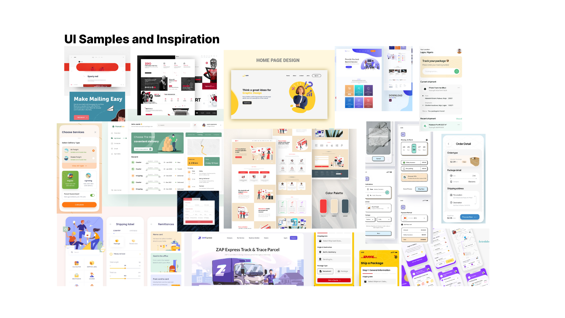
Australia Post

Australia Post Photo

Overview

The objective of this project was to redesign an Australian government website and I chose Australia Post. The redesign was completed in four weeks, and the project involved several stages, including user research, heuristic evaluation, prototyping, usability testing, and card sorting.The focus of the Australia Post website redesign was to enhance the parcel sending experience for users starting from the homepage. In achieving this goal, a crucial aspect that significantly contributed to a better user experience was information architecture. Let me walk you through the process on how information architecture played a vital role in the redesign.

Upon completing the project, I successfully delivered a high-fidelity prototype that showcases the new look and feel of the Australia Post website. The prototype features a user-friendly and responsive interface that ensures optimal accessibility for all users.

Roles & Responsibilities

Tools

Timeline

Background

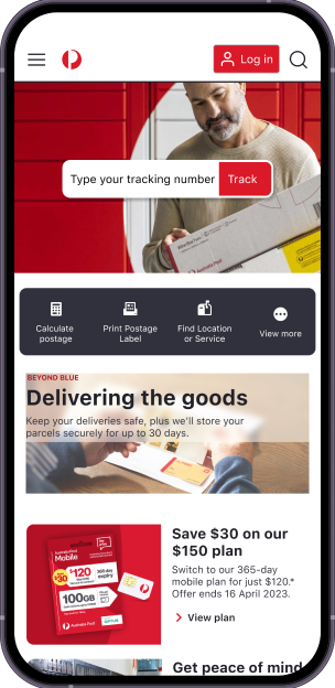
Australia Post is the national postal service provider in Australia. It operates as a government-owned corporation, offering essential mail and parcel delivery services to individuals and businesses. Everyone in Australia knows Australia Post- its distinct brand colour and their iconic logo.

Understanding the Problem

I started by developing the Proto-Persona to be able to identify specific tasks to focus on for the website redesign. In my case, I chose to prioritise the common task of "Sending an Item,".

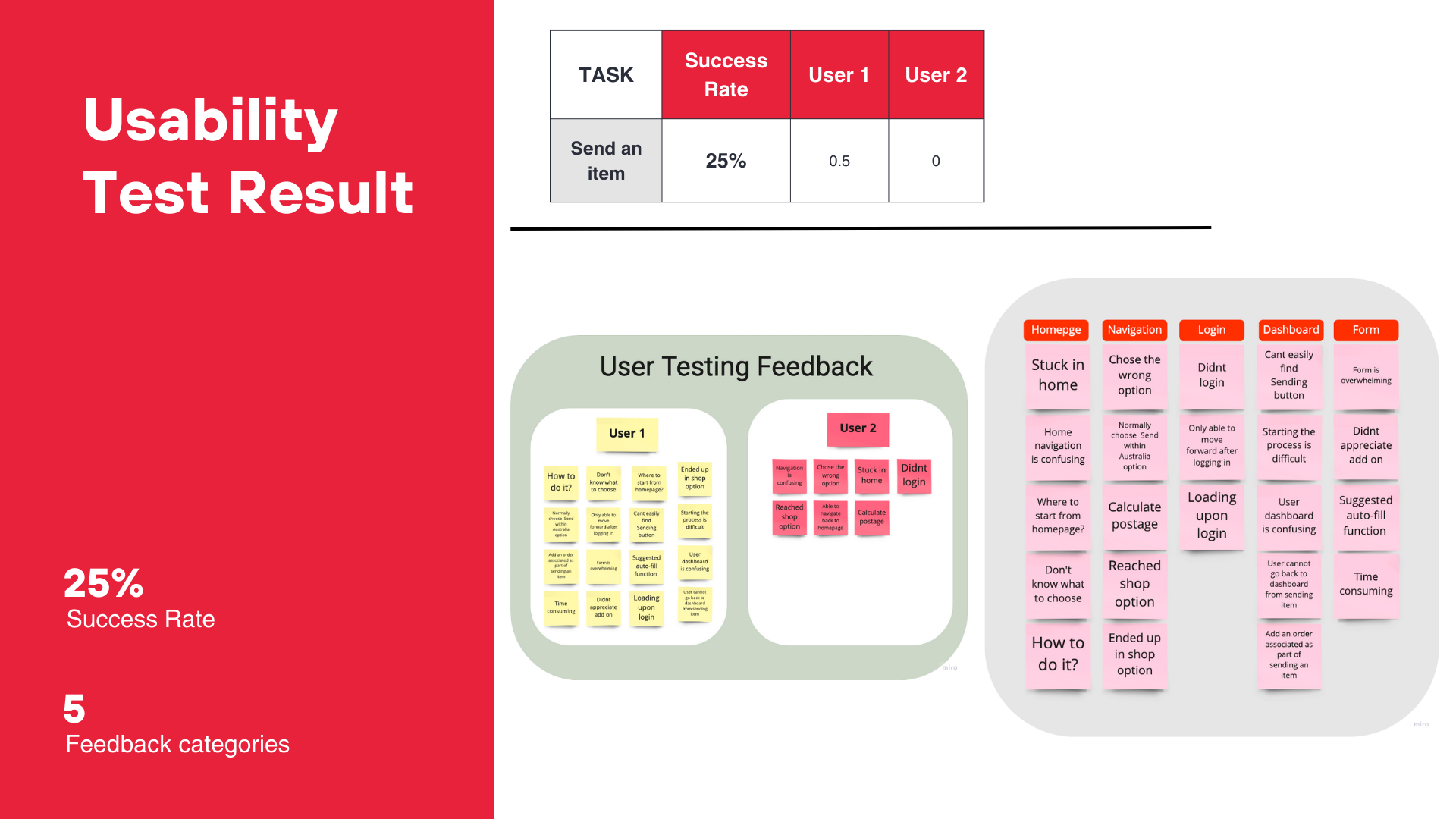
To be able to identify the problem I wanted to test the user experience of sending an item using the Australia Post website. The task was for the user to send an item with the success criteria of reaching the payment details page (see the Wireflow here). I invited two of my classmates to complete the usability testing.

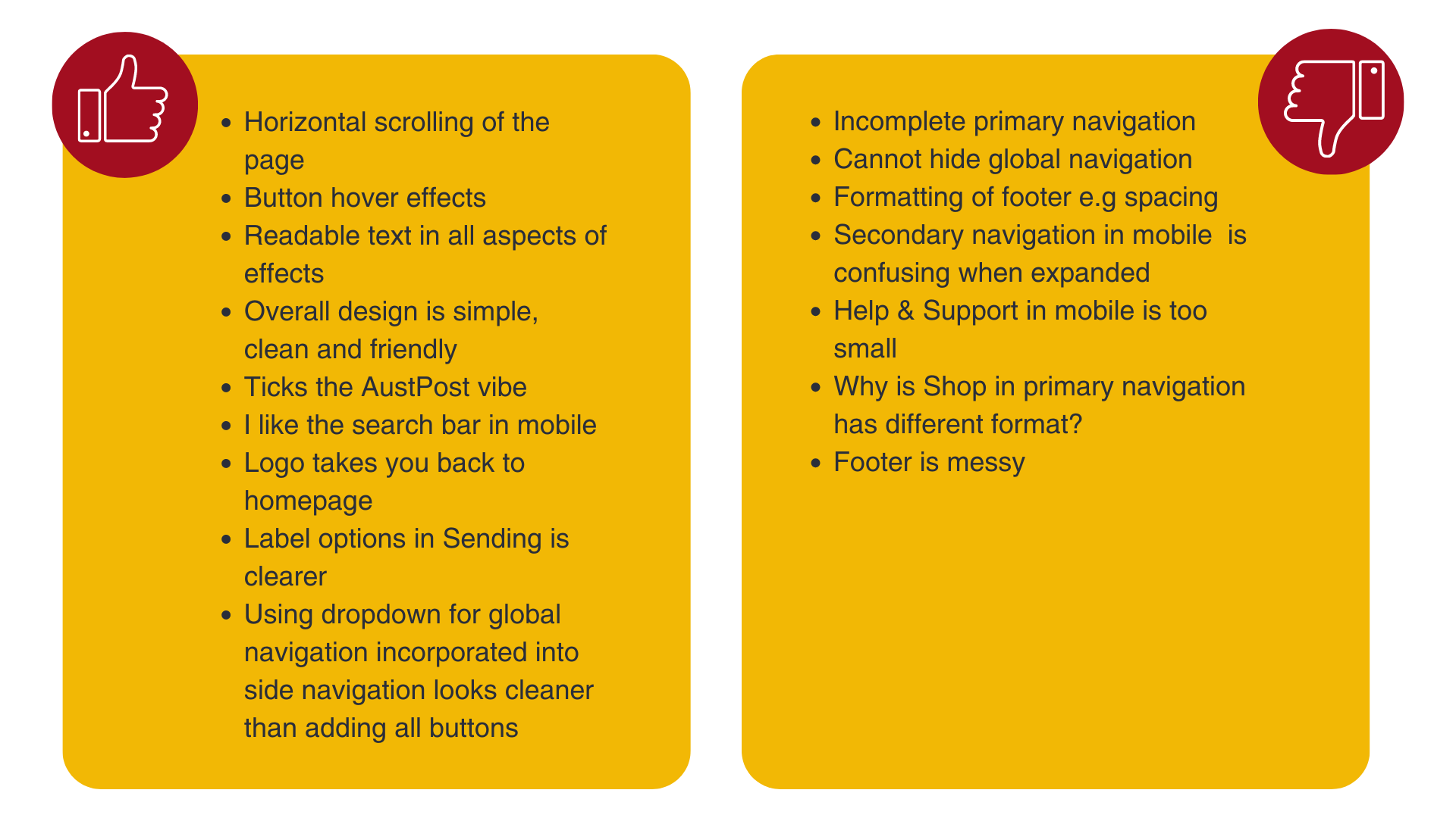
The result below shows that one user partially completed the task but both were equally frustrated on how difficult it is to send an item using the Australia Post. A recorded video of the test sessions for User 1 and User 2 has been linked for reference.

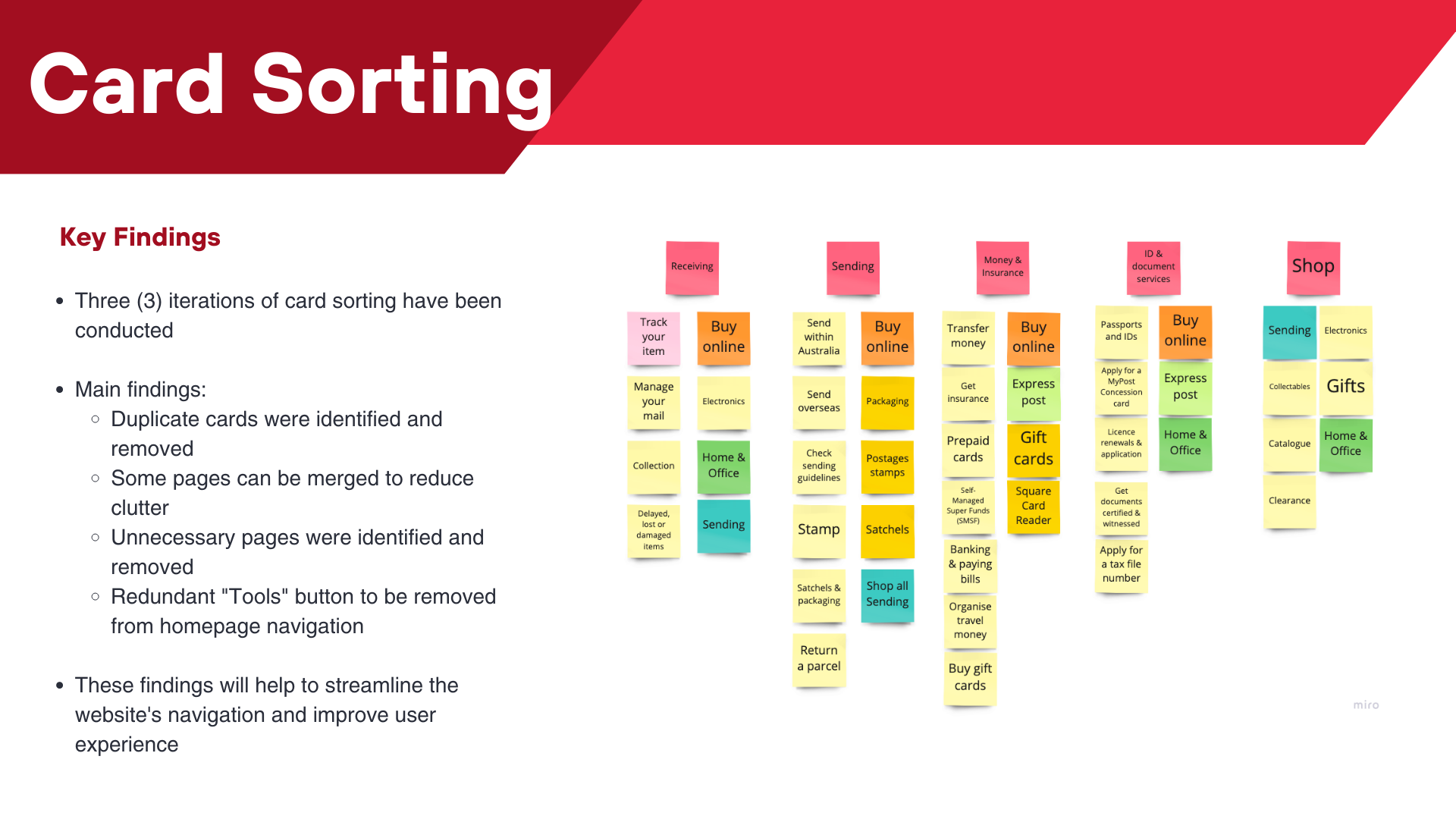
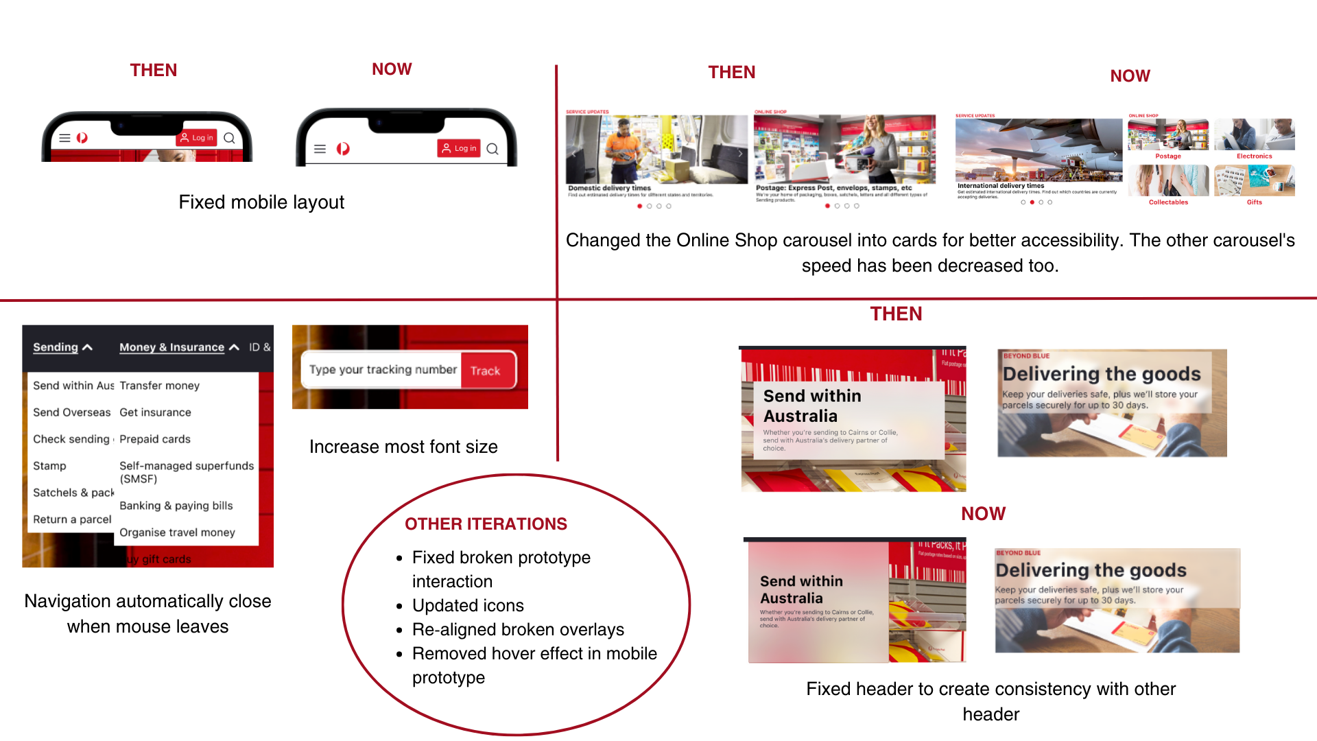
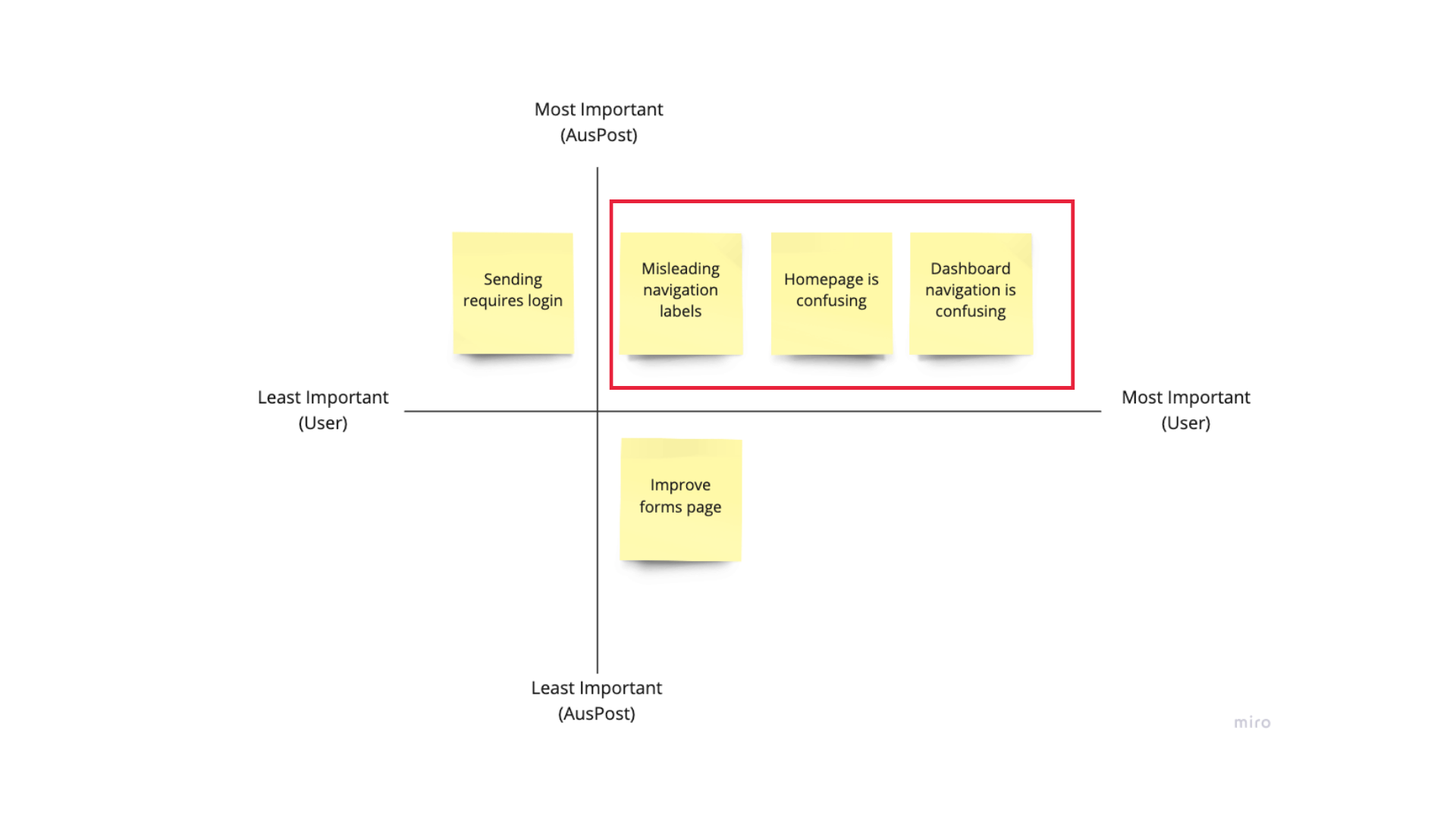
From the testing, five common themes emerged: Homepage, Navigation, Login page, Order Dashboard, and Sending Form. Using the prioritisation matrix, I plotted the things identified that would be considered important for the user and the client. Below shows that a focus on navigation is required.
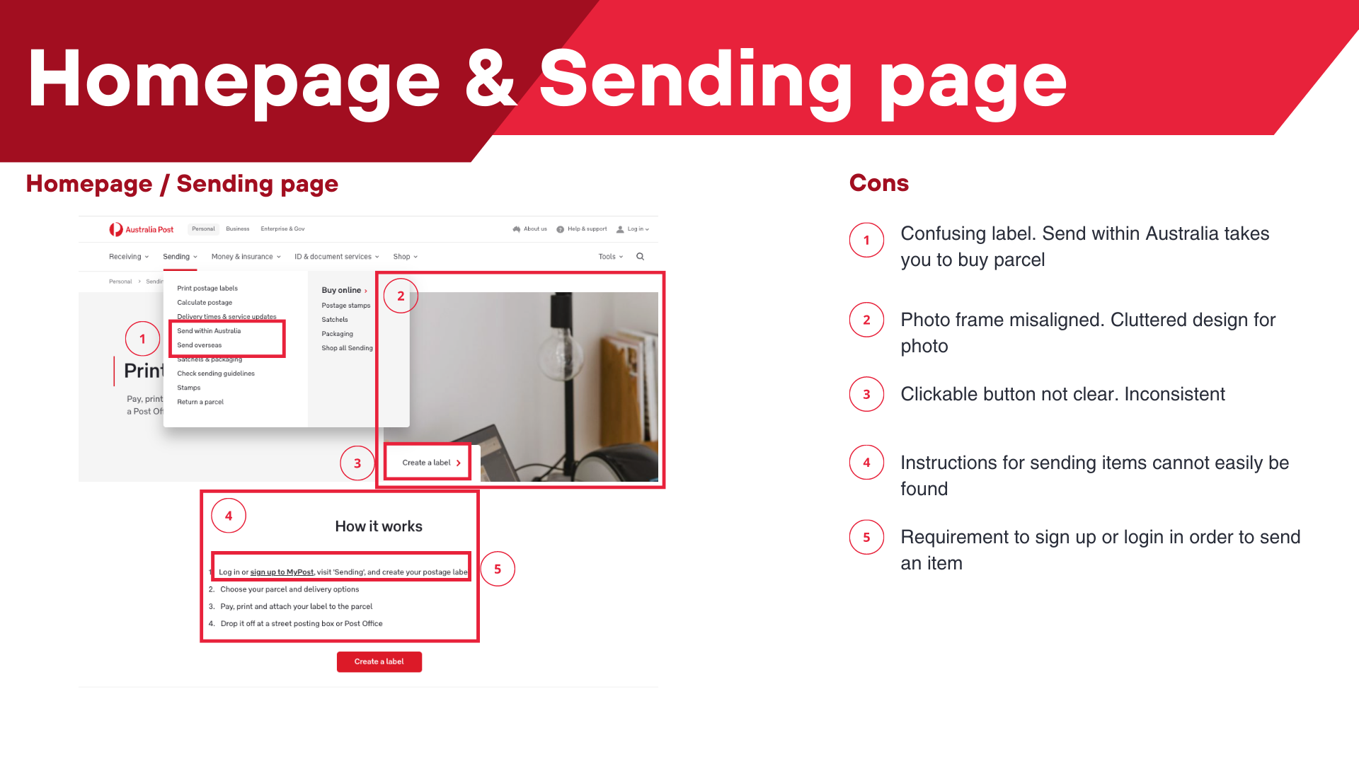
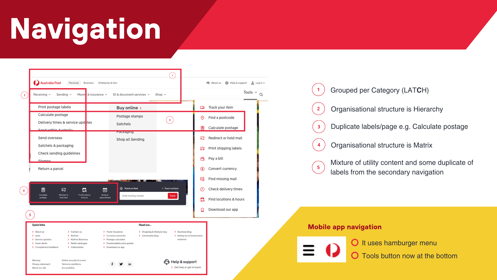
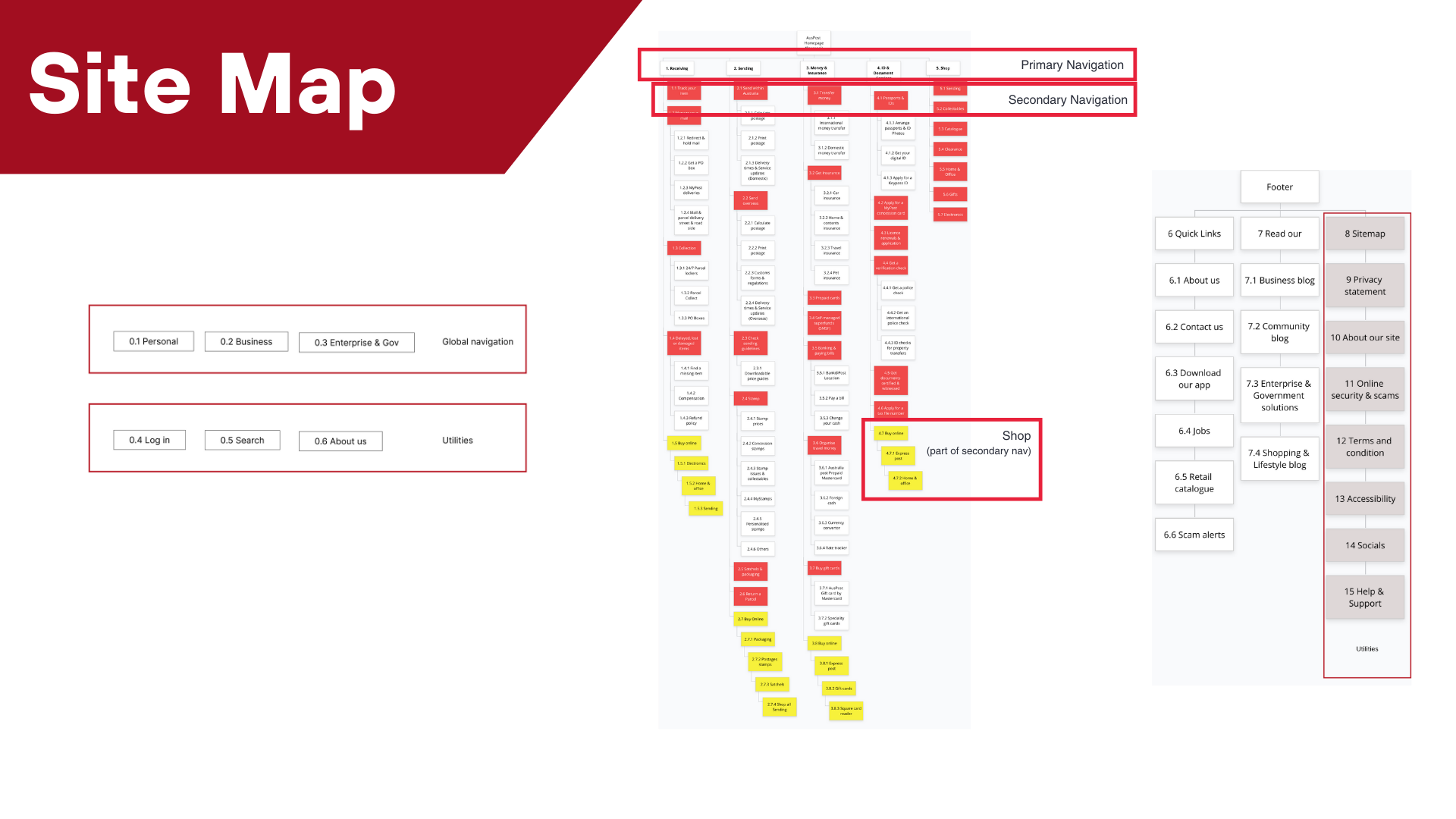
Problem statement:

How might we address the challenges of confusing homepage navigation, misleading navigation labels, and the lack of focus on key services in the Australia Post website redesign, specifically targeting the improvement of the homepage, footer, and navigation?

Usability & Heuristic Insight

As a designer, I conducted a comprehensive analysis of the Australia Post website, delving into its heuristic principles, usability factors, and accessibility considerations.


I also used card sorting techniques to organise the information on the Australia Post website. Through this, I was able to gather valuable insights from users and translate those findings into a coherent sitemap.


Moodboard

To kickstart the design process, I began by creating a moodboard specifically tailored for this project. You can view the full moodboard here.

Wireframing

I proceeded to create wireframes for both the desktop and mobile versions of the Australia Post website.

User Testing

I enlisted the help of three classmates to conduct usability testing for the initial wireframe design. The results of the testing revealed valuable insights and feedback that contributed to the iterative improvement of the wireframe.

After refining the wireframe based on the feedback, I proceeded to develop a high fidelity prototype. To ensure thorough testing, I engaged five users in the usability testing process. The primary task assigned to them was to send an item within Australia using the website or mobile app. Throughout the testing, special emphasis was placed on evaluating the navigation and footer components, allowing for a comprehensive assessment of their functionality and usability.


Photos & Documentation

Findings

Here is a list of the final iterations based on the findings from the last user testing, showcasing the improvements in the "Then vs Now" comparison:

Final Thoughts

When I started this project, I identified three key reasons why a website redesign was necessary for Australia Post:

  1. Information Overload and Duplication: The current website has heaps of information, often leading to duplicate content.
    • To address this, I conducted card sorting and sitemap exercises to identify the primary navigation buttons and streamline the information architecture.
    • One observation I made during the redesign process was the presence of a tool button in the navigation, located next to the search bar. However, upon further examination, I noticed that most of the tools available in the button were already duplicated in the homepage and navigation sections. This redundancy was also observed in the footer of the website.
  2. Misleading Labels: I observed that certain navigation labels, such as "Send Within Australia," were misleading, as they didn't lead to the expected pages.
    • To rectify this, I made changes to the structure of the Sending section, ensuring that commonly accessed features, like calculating and printing postage, were placed under a secondary navigation within the "Send Within Australia" page.
    • The secondary navigation refers to the grey navigation bar located underneath the hero photo on the website. It serves as an additional navigation tool, providing access to specific sections or features that complement the primary navigation.
  3. Focus on the Main Service: It was crucial to emphasise Australia Post's primary service, which is Sending Items.
    • The current website only featured four items in the secondary navigation, so I added four additional items to showcase commonly used services. These additions were derived from the tools buttons that users typically overlook, ensuring their visibility and accessibility.

As part of the project, I also created a comprehensive UI style guide to ensure consistency and cohesion in the design elements of the Australia Post website.


Final Prototype

Here’s a video of the final prototype. You can also check the clickable desktop and mobile prototype.